Model data in Power BI
Creating relationship between your data sources
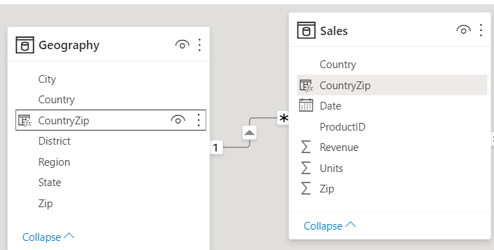
In the Model view, notice that a block represents each table and the lines between them represent relationships.
Adding and removing relationships is straightforward. To remove a relationship, right-click the relationship and select Delete. To create a relationship, drag and drop the fields that you want to link between tables.

To hide a table or individual column from your report, right-click the table or column in the Model view and select Hide in report view.

For a more detailed view of your data relationships, on the Home tab, select Manage Relationships. The Manage Relationships dialog box displays your relationships as a list instead of as a visual diagram. From the dialog box, you can select Autodetect to find relationships in new or updated data. Select Edit to manually edit your relationships. You'll find advanced options in the Edit section to set the Cardinality and Cross-filter direction of your relationships.

Creating calculated columns
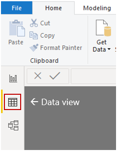
To create a calculated column, select the Data view in Power BI Desktop from the left side of the report canvas.

From the Table tools tab, select New Column to enable the formula bar. You can enter calculations by using Data Analysis Expressions (DAX) language. DAX is a powerful formula language that lets you build robust calculations. As you type a formula, Power BI Desktop displays matching formulas or data elements to assist and accelerate the creation of your formula.
The Power BI formula bar will suggest specific DAX functions and related data columns as you enter your expression.

After you have created the new CountryZip calculated column in each table, they can be used as a unique key to establish a relationship between the two tables. By going to the Relationship view, you can then drag the CountryZip field from the Sales table to the Geography table to create the relationship.

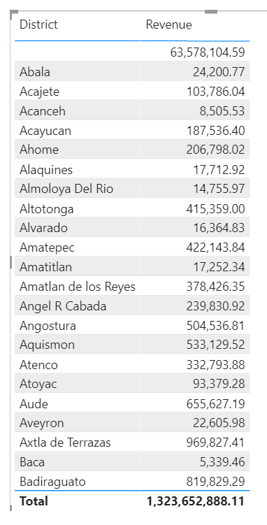
When you return to the Report view, notice that a different value for each district shows.

Hide fields
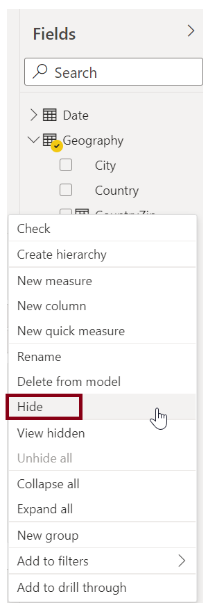
To hide a field in the Fields pane of Power BI Desktop, right-click the column and select Hide. Your hidden fields aren't deleted. If you've used a hidden field in existing visuals, the data is still there; the hidden field just isn't displayed on the Fields pane.

If you view tables in the Model view, hidden fields appear dimmed. The data in these tables is still available and is still part of the model. You can unhide any field that has been hidden by right-clicking the field and then selecting unhide.
Creating measures
After you've created a new measure, it will appear in one of the tables on the Fields pane, which is found on the right side of the screen. Power BI inserts the new measure into whichever table you have currently selected. While it doesn't matter, exactly, where the measure is located in your data, you can easily move it by selecting the measure and using the Home Table drop-down menu on the Measure tools tab.

You can use a measure like any other table column: just drag and drop it onto the report canvas or visualization fields. Measures also integrate seamlessly with slicers, segmenting your data on the fly, which means that you can define a measure once and then use it in many different visualizations.


Comments
Post a Comment